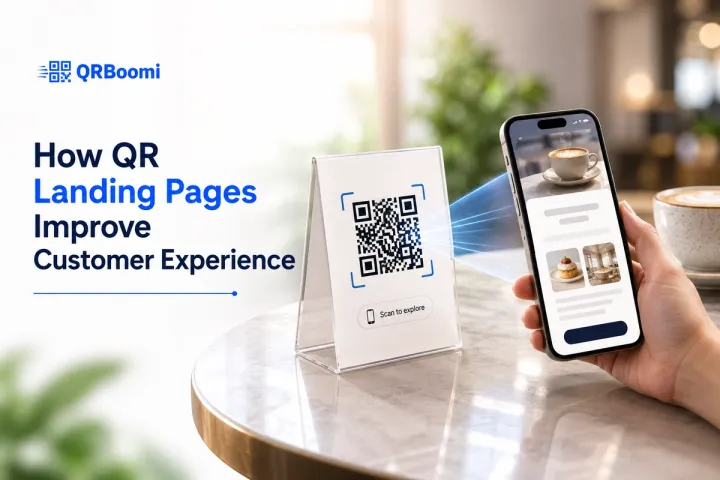
A customer scans your QR code with a specific expectation. They want the lunch menu, the event schedule, the discount code, something clear enough that they pulled out their phone in the middle of whatever they were doing to get it. Then the code dumps them on your homepage, next to a hamburger menu and six links that have nothing to do with why they scanned in the first place.
That gap between what the customer expected and what they actually got is where most QR experiences quietly fail. The code was never the experience. What happens on the screen after the scan is.
QUICK ANSWER
QR landing pages improve customer experience by replacing a generic destination with a single, purpose-built page that matches the exact reason someone scanned. Specifically, a dedicated landing page loads fast, mirrors the context of the code (a menu, an event, a promotion, a product), and gives the customer one clear next step instead of a cluttered website, which removes friction and makes the interaction feel intentional instead of accidental.
The Problem: Most QR Codes Redirect, They Do Not Welcome
Ask most businesses what happens when someone scans their QR code, and the honest answer is usually “it goes to our website.” That answer is the problem.
A homepage is built for browsing. It has a navigation bar, a dozen competing calls to action, and no idea why this particular visitor showed up. A customer who just scanned a code on a table tent, a flyer, or a product box is not browsing. They are mid-task, and they expect the page to already know why they are there.
When it does not, the mismatch shows up fast. Visitors bounce before reading anything. Forms go unfilled. The QR code gets blamed for underperforming, when the actual issue is the experience waiting on the other side of the scan.
Slow load times make the problem worse. Mobile UX research has suggested that approximately half of mobile visitors abandon a page that takes more than three seconds to load, though that figure is a general industry benchmark rather than a number specific to your own audience and is worth verifying against your own analytics. On a QR scan, where someone is often standing in a checkout line or at an event with a badge in one hand and a drink in the other, that patience is even shorter.
The QRBoomi Scan-to Experience Framework
We built this framework after watching a pattern repeat across very different campaign types: restaurants, events, retail, real estate. Businesses invest in the code (the print quality, the placement, the branding) and then link it to a page that has nothing to do with the moment the customer is actually in.
The framework breaks the post-scan experience into four stages. Each one is a point where a customer either feels understood or feels like an afterthought.
1. Context Match
The page has to match the physical trigger. A code on a restaurant table should open a menu, not a homepage. A code on an event badge should open the agenda, not a general “about us” page. If the customer has to hunt for relevance, the experience has already failed.
2. Frictionless Entry
The page needs to load fast and read clean on a small screen, with one primary action visible before any scrolling. We cover the specific design mechanics of this stage in detail in how to design a mobile-friendly QR landing page, including load time targets, layout rules, and legibility standards.
3. Relevant Continuation
A good QR landing page continues a story the customer already started, rather than restarting it. If the flyer promised 20 percent off, the landing page should open on that offer, not a generic welcome message. Continuity is what makes the jump from print to screen feel seamless instead of jarring.
4. Trackable Follow-Through
This is the stage most static QR tools skip entirely, because a fixed code pointing to a fixed URL cannot report back or be adjusted. A dynamic QR code paired with a managed landing page lets a business see which version of the page customers actually respond to, and update the experience without reprinting anything.
What a Poor Post-Scan Experience Actually Costs
The cost of a bad QR experience rarely shows up as a single, visible failure. It shows up as a quiet erosion of trust that is easy to miss if you are only counting scans.
A customer who scans a code and lands somewhere confusing does not usually complain. They just leave, and they remember, consciously or not, that scanning your codes was not worth it. The next code you put in front of them gets less benefit of the doubt.
A few patterns we see repeat across underperforming campaigns:
- Linking to the homepage instead of a dedicated page, forcing the visitor to search for relevance they expected to find immediately
- Asking for account creation or heavy form fields before showing any value in return
- Using a static code, so a typo, a seasonal update, or an expired offer sits live until every printed code is replaced
- Treating scan count as the only metric that matters, with no visibility into what happens after the tap
None of these are catastrophic on their own. Together, they train customers to associate your QR codes with friction rather than convenience, which defeats the entire point of using them.
Designing QR Landing Pages That Feel Like Part of the Journey
A landing page that improves customer experience is not necessarily more elaborate. Often it is simpler and more specific than what businesses default to.
QRBoomi's QR landing page builder is built around that idea. Instead of pointing a code at a website you already have, you build a focused, mobile-first page for the exact moment the code represents, whether that is a menu, an event registration, a promotion, or a lead capture form, and connect it directly to the dynamic QR code driving traffic to it.
A few practical habits carry the most weight for customer experience specifically:
- Open with the exact thing the print material promised, not a broader welcome message
- Keep the page to one primary action, since asking for a second decision at this stage usually loses both
- Match your brand's visual identity closely enough that the jump from print to screen feels like the same brand talking, not a different one
- Build the page to be editable, so a seasonal menu change, a sold-out event, or an updated offer never leaves a customer looking at outdated information
Across QRBoomi campaigns, the pages that perform best on customer experience metrics are consistently the ones built for a single scenario rather than reused across several. A page trying to serve a restaurant's menu, feedback form, and loyalty signup all at once tends to serve none of them well.
Turning Better Experience Into a Repeatable Advantage
Improving one QR landing page is a design exercise. Improving customer experience across every QR touchpoint you run is a measurement problem, and that is where dynamic tracking earns its place.
When a QR code is dynamic, the destination it points to can be updated without reprinting, and every scan can be tracked by device, location, and time. That combination means a business is not guessing whether a page design worked. They can see it in scan-to-conversion data and adjust the experience for the next customer, not just the next campaign.
This is also where customer experience and campaign performance stop being separate conversations. A landing page customers find fast, relevant, and easy to act on is, by definition, the page that converts better. The two outcomes come from the same design decisions.
Key Takeaways
- The post-scan experience, not the QR code itself, determines whether a customer feels understood or ignored
- The QRBoomi Scan-to-Experience Framework covers four stages: context match, frictionless entry, relevant continuation, and trackable follow-through
- A generic homepage redirect is the single most common way businesses undercut their own QR campaigns
- Landing pages built for one specific scenario consistently outperform pages trying to serve several purposes at once
Dynamic QR codes let you fix, update, and improve the customer experience after the code is already printed and in the world.
The QRBoomi POV
Most advice on QR codes still treats the code as the product. We think that is backwards. The code is just the invitation. The landing page is where the customer decides whether your brand is easy to deal with or one more thing standing between them and what they came for. A QR campaign built without that page in mind is optimizing the wrong half of the interaction.
Frequently Asked Questions
QR landing pages improve customer experience by giving scanners a page built specifically for the moment they scanned, instead of a generic website. That means faster load times, content that matches what the print material promised, and one clear action, which removes the friction that makes customers abandon a scan halfway through.
A QR landing page is designed for a single scenario and a mobile screen, while a regular web page usually serves multiple visitor intents across devices. The QR landing page assumes the visitor arrived mid-task with low patience, so it drops navigation clutter in favor of one relevant message and one action.
No. Most businesses reuse a base template and adjust the content, offer, and branding for each campaign or location. QRBoomi's landing page builder is designed around this workflow, so teams can launch a new post-scan experience without building a page from the ground up every time.
Only if the code is dynamic. A dynamic QR code points to a destination you control, so you can update the landing page, offer, or messaging at any time. A static QR code locks that destination permanently the moment it is printed, which limits how much you can improve the experience later.
Yes. A page that feels relevant and loads quickly reduces the number of people who leave before taking action, which shows up directly in scan-to-conversion rates. Customer experience and conversion performance are closely linked here because they are shaped by the same design decisions.
Start by checking where the code currently points. If it leads to a homepage or a page unrelated to the print material's promise, that mismatch is very likely the biggest issue. Replacing it with a dedicated, dynamic landing page is usually the highest-impact fix available.